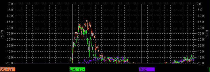
This plot is a 'rolling' graph of DCF-39's relative signal level over somewhat more than the last day ; it has a resolution of and is refreshed every two minutes. The orange curve is DCF-39, the purple trace the peak signals within an adjacent slice of spectrum just below DCF-39's frequency; this gives a rough indication of signal-to-noise ratio, and, should it be abberant at all, a measure of confidence in the measurements overall.
A corresponding signal-versus-time plot for a similar data station in Lakihegy (Hungary) on 135.430kHz is shown with that for DCF-39, in green.
No apologies for the interesting colour schemes; 3-D clip-on glasses may help.